
Scouting the Basketball Data with EDA
Looking at trends in game scores over the years in the NBA
Introduction
As my previous blog post mentioned, I would be looking at data from the total game scores to look at trends over time found and collected using an API. Now that the data has been collected and put into a dataframe (found in my Github Repo called NBAGames.csv).
There are definitely some interesting trends and comparisons to be made here in terms of exploring this data. A few things we will be looking at is comparing average total scores since 1980, each team’s average scoring advantage while playing at home, postseason vs. regular season scoring, and breaking down the Western Conference vs. Eastern Conference scoring trends (as well as within each division). Additional NBA statistics can be found on the official NBA stats website.
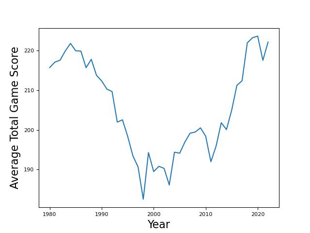
Total Scoring Over the Decades
By no means, was I expecting the average scoring per game in the NBA to have such a wide discrepency over the years. I figured the average would deviate maybe 10-15 points up or down throughout the last few decades, but we see much more deviation in the following graph.
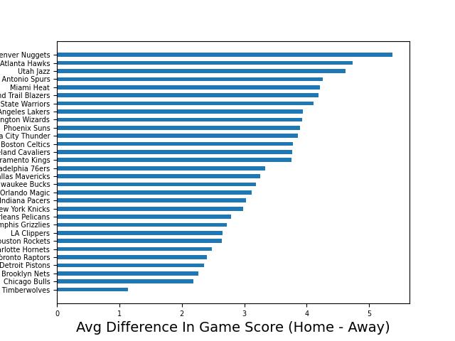
Home vs. Away
This metric was found by finding the difference between each team’s average score while playing at home and playing on the road. Using this graphic, we can see how teams stack up with each other in terms of offensive production increase by playing at home.
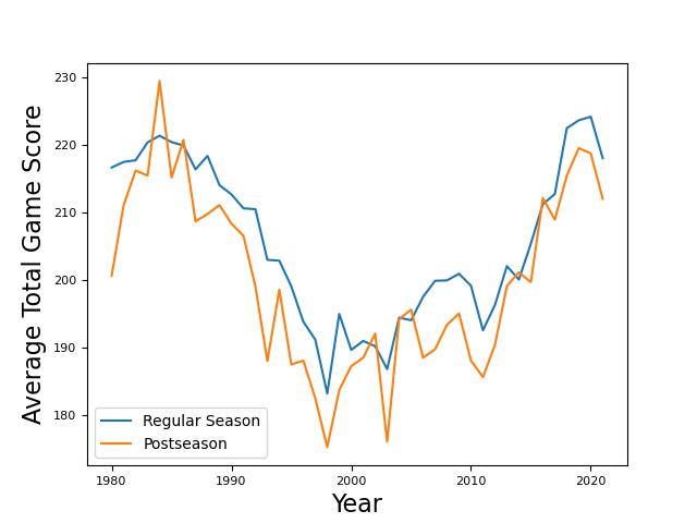
Regular vs. Postseason Scoring
Again, this graphic showed me exactly the opposite of what I was expecting. In my limited watching of the NBA postseason (which is limited to the Utah Jazz), I have seen more high scoring games than during the regular season, but the data says otherwise.
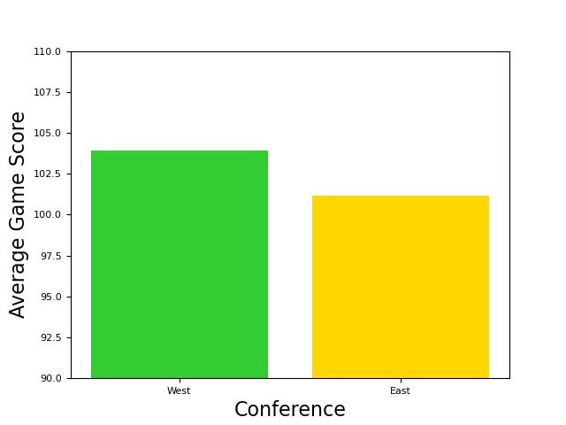
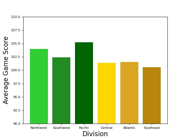
Conference and Divisions Breakdown
Using these two graphics, we can see which conference scores more on average (West Conference) and then how each conference average is broken down between the respective three divisions within each conference.
And here are the two conferences broken up into divisions.
Conclusion
While many of the trends I was expecting were not as explicit as I had anticipated, exploring the data through the graphics was still intriguing to me, especially looking at team by team comparisons. If the trends on the graph make you wonder what might be causing those trends, Basketball Reference can give even more insight into what is causing those trends. It allows you to look at league, team, or player averages over any desired span of time. I will definitely be using Basketball Reference in my next post where I look deeper into what might be causing the trends we see around the league. If basketball is of any interest, I recommend checking it out as well to try and make your own conclusions!